Diablo Dips is a hot sauce brand that reimagines the classic devilish theme with a bold, contemporary aesthetic.
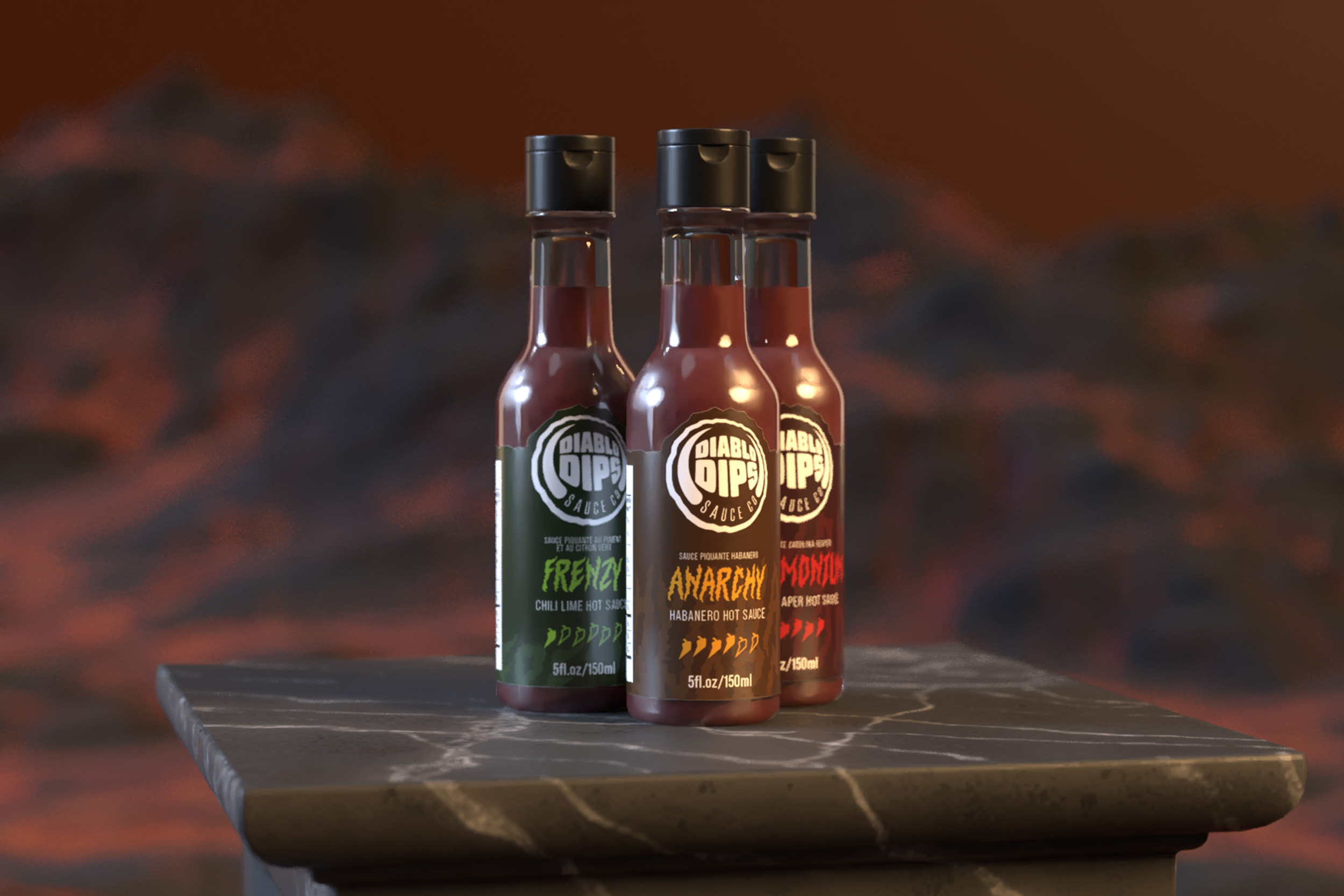
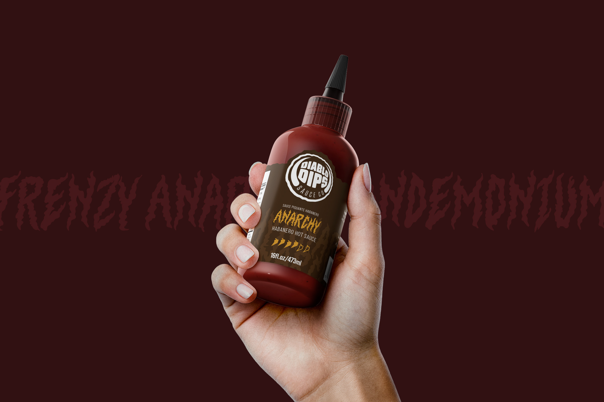
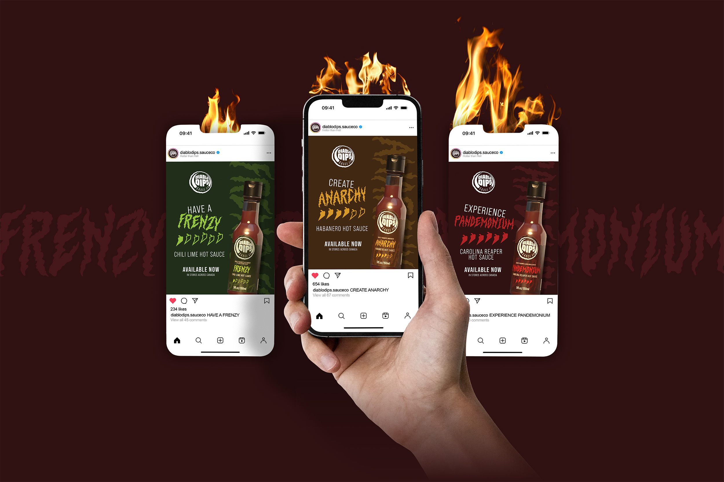
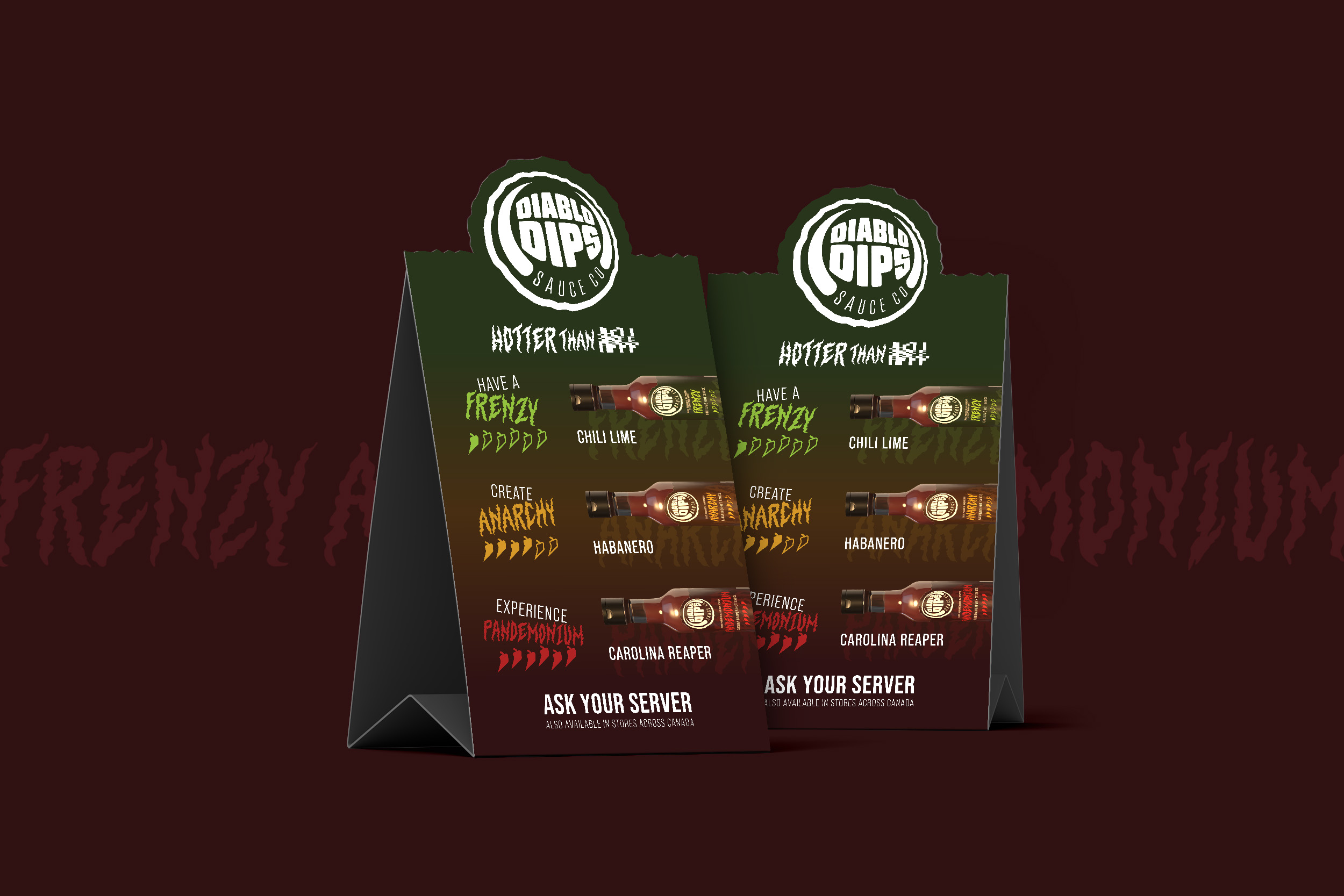
Built around intensely spicy sauces and chaotic flavour names, the branding combines fiery colour palettes, expressively aggressive typography, and striking label designs to stand out on the shelf.
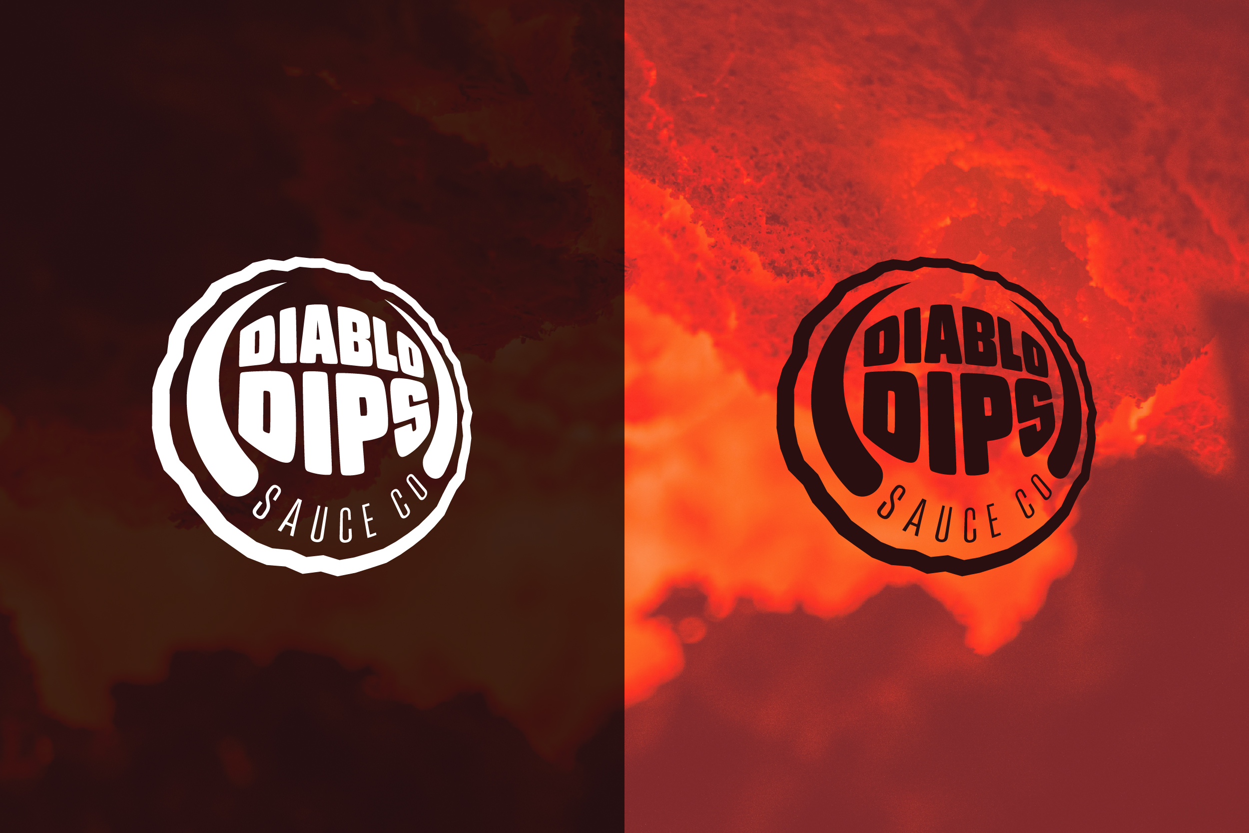
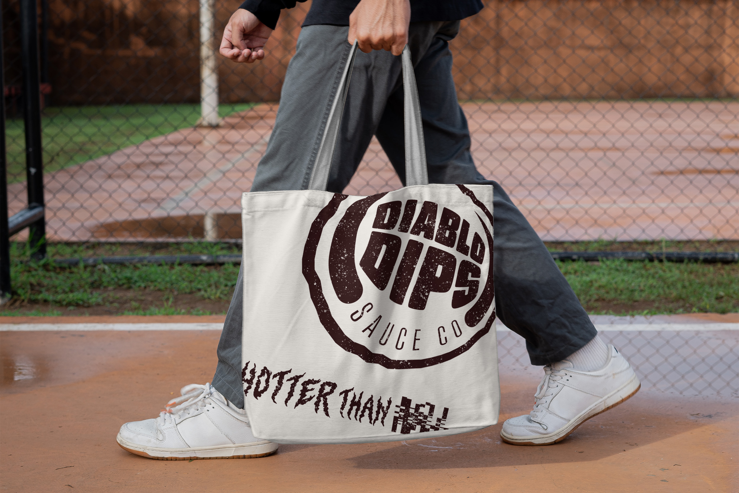
Their logo balances aggression and legibility, featuring angled letterforms, subtle horn-inspired details, and a rough circular seal that evokes a traditional wax stamp.
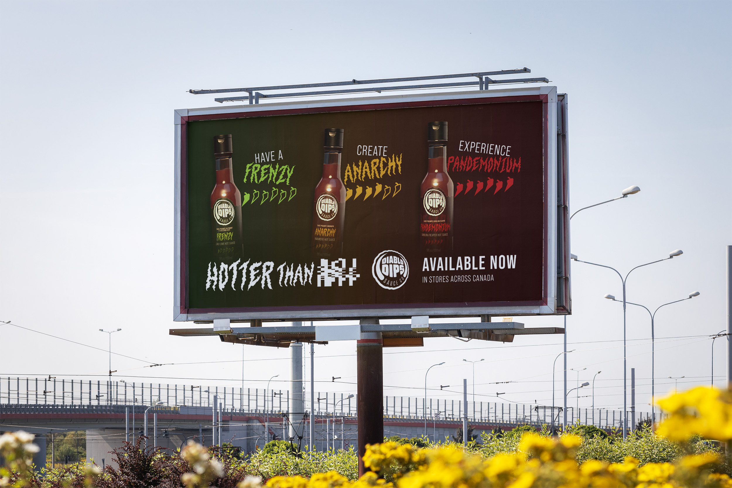
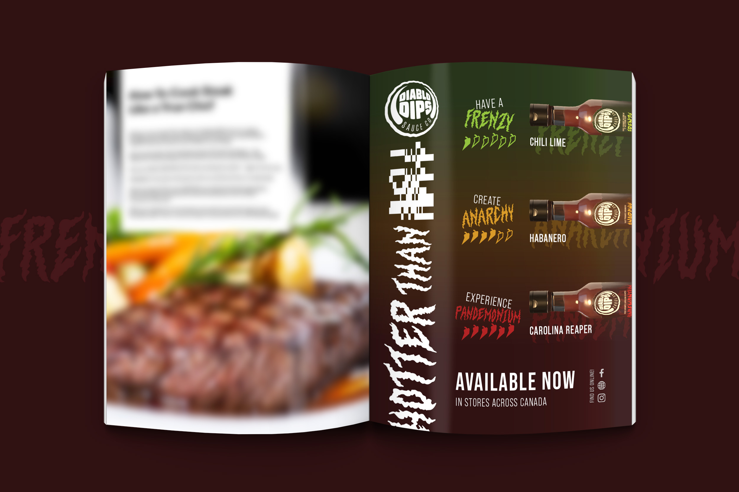
Paired with the tagline “Hotter Than H***”, the identity captures the brand’s aggressive, high-heat personality while remaining modern, memorable, and scalable across packaging, advertising, and any required digital applications.
CATEGORIES:
Advertising & Marketing Design, Brand Design, Packaging Design, Merchandise Design